Poor readability of the user card due to profile banner usage
Mirrored from https://akkoma.dev/AkkomaGang/pleroma-fe/issues/128
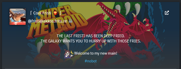
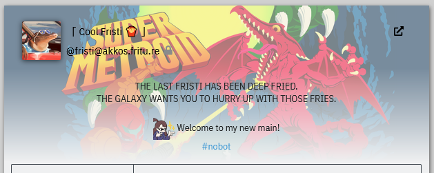
One of the things that has always irked me about pleroma-fe, is how the profile banner is used as a background for the whole user card. This can cause problems with readability of the user bio, depending on the combination of image and theme used.
Take my own profile for example:
Especially on the light theme, the username and handle are poorly readable due to the combination of the image and black text. It's somewhat better with the dark theme, though not great either. The problem only gets worse once you start considering themes with lower contrasts.
I would suggest changing the user card so that the profile banner is actually used as a banner, like in other microblogs like mastodon and misskey. This will also make it easier for a user to get their profile to look more consistent across the different microblogs.
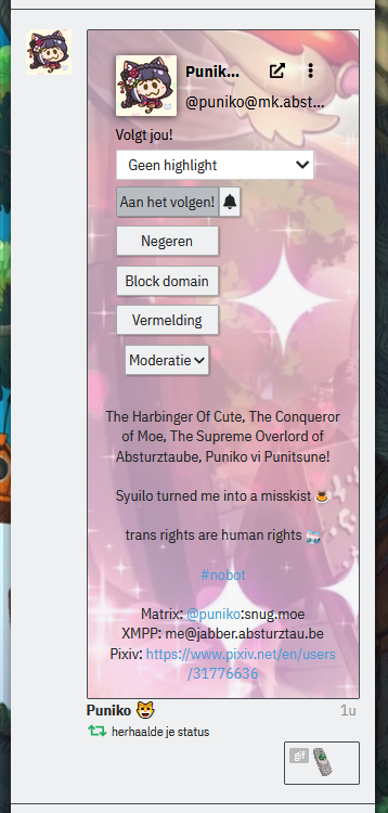
On a side note, if we're to redesign the user card, we might also take into account making it look better in notifications, since it currently is just a squashed mess:
I'm currently working on a little something to move some of the buttons into the top-right menu to free up more space, but I think this could also be far more condensed if the user card as a whole got a little redesign.


