Suggestion - enhancement for AWI mode, with 2 panels filling wide displays. Reader and Writer friendly. [also posted at Glitch-Social Git]
Pitch
A proposal for consideration -- that Advanced Web Interface could better support wide screen displays, for users interested in using two panels of information. (as opposed to the typical narrow, numerous ones à la TweetDeck).
Motivation
The Advanced Web Interface in Mastodon was closely modeled on the TweetDeck app. It works well for users accustomed to narrow panels and a fast moving display of Feeds in each. Eugen R recognizes this as his model for AWI.
This was never attractive to me. I have tweaked settings and been able to improve the screen usage in my system substantially.
At first, this was highly dependant on the instance's Themes -- two that I have accounts on (Todon.nl and Qoto.org) had improved their AWI themes, and setting up with two panes worked fairly well.
Screenshot 1 : the AWI display at Qoto.org, using Dark Theme wide display :
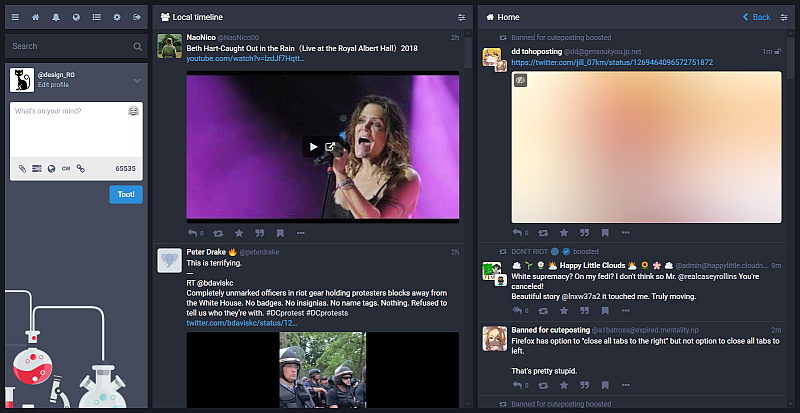
In typical day to day use, I tend to have the Local Feed in the left panel, and a Notifications on the right panel. So far so good.
Improving AWI via an add-on :
But -- I managed to get it better, enhanced via use of a Firefox add-on called Collapsed Mastodon.
With Collapsed Mastodon installed and the instance added to its configuration, the 2 pane view at Qoto now displays this :
Screenshot 2 : AWI theme, enhanced by Collapsed Mastodon, at Qoto.org; Dark Theme, wide display :
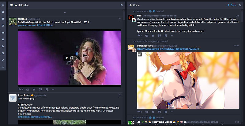
The leftmost area where the Toot Editor is typically located has been collapsed. The information panels fill the width of the screen almost completely. (This would also happen if AWI was being used in 3 or 4 Columns mode)
Replying ? New Toots? How is it done?
I like and enjoy working in this mode - it has some good points for it :
- the client uses the full width of the display.
- not only removing the mostly empty space in the leftmost part (bellow the Toot editor box)
- but adding a Reply Toot Editor below any post on the screen
This last feature is so neat that I wish the mainstream AWI would incorporate it. On the standard AWI mode, the left space is sacrificed to keep an inactive Toot Editor, idle until needed.
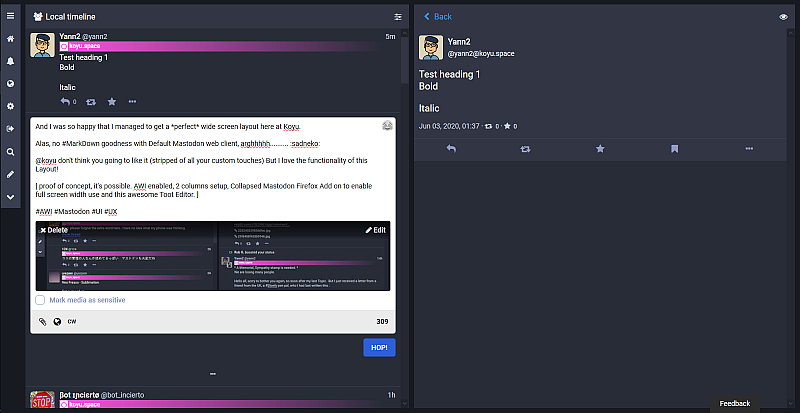
The Collapsed Mastodon does that, instead, by opening a Reply Editor below any post on the screen, when you click the Reply arrow.
Screenshot 3 : Reply Toot Editor box below one of the on-screen toots. Taken at a Glitch instance.
Advantages and Benefits ?
This Toot Reply Editor is immediately below the post being replied to, so you can keep an eye and refer to it easily. It also starts at a decent vertical size, and with the fairly large width of this panel, it can contain a lot of text.
The editor will expand as long as needed, so it’s a boon for anyone writing long replies; no visual stress or cramped, narrow editor to type in.
A new Toot all together will pop up a smaller sized Edit box in the Left side Panel - near the Pencil Tool icon. It is smaller than the full column width, but still a nicer writing space that the typical in mastodon.
My main instance allows 5 thousand characters maximum allowed toot size -- so we tend to enjoy freedom and post Long Form frequently.
I had prepared a detailed topic in our Discourse Forum, explaining the possibilities and advantages.
Conclusions :
And now would like to offer the Pleroma MastoFE (as well as the Glitch-Social FE team) this input, to be considered for adoption into the code base.
The enhancements done by Eskuero, the creator and maintainer of Collapsed Mastodon, could be analyzed and possibly imported into the codebase -- I believe this is a much more functional setup than the current AWI implementation.
Eskuero's project is on this Git.
Thank you for your attention and consideration.
Rob G., @rgx@muensterland.social [ originally posted at the Glitch-Social Github]