polish preview styles a bit
the styles for the preview toggle started bothering me a bit, this is the current one on my instance default theme, the 'Preview' text isn't aligned, the icon looks too big and works the wrong way.

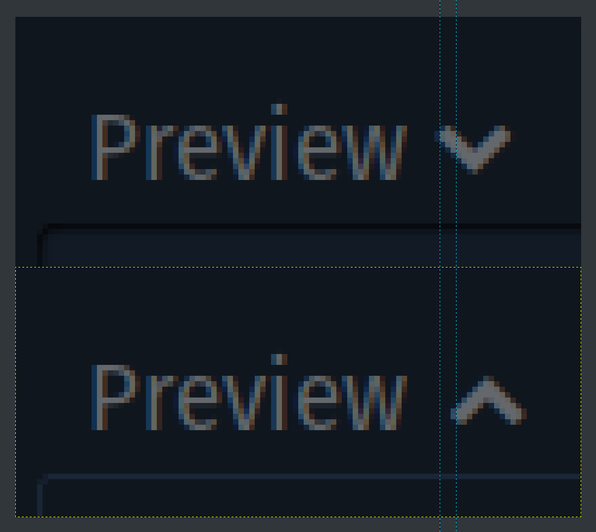
here's what it looks like in this branch, icon is smaller, padding matches input padding, icon no longer uses transform which puts the icon off center in an annoying way:

and with preview active:

Merge request reports
Activity
 Resolved by Shpuld Shpludson
icon has poor vertical alignment
- Last reply by Shpuld Shpludson

-
it might look better, but I think semantically it'd make things more inconsistent, it's not adding or removing things like with poll options or profile fields where we use plus. instead it's toggling visibility of something. something else might work as well so I'll try look around
added 9 commits
-
7859c5fe...297a0c1f - 7 commits from branch
develop - 3cac26a2 - Merge branch 'develop' into fix/preview-styles-polish
- 51b235f7 - adjust icon use
-
7859c5fe...297a0c1f - 7 commits from branch
added 1 commit
- 0546326b - update icon to hopefully look fine on both browsers
mentioned in commit f293dc39